In the last Risk Management post I showed how to quickly highlight to stakeholders the key risks facing the project or program. Another tool I like to use alongside the Risk Map is a Risk Burn Down Graph. Risk Burn Down graphs are very useful for seeing if the total project risk is increasing or decreasing over time. It allows stakeholders to see instantly if we are reducing project risk.
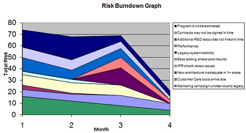
An example Risk Burn Down Chart is shown below (this risk burndown graph should be kept up to date as part of your project risk analysis work):
There are two key pieces of information which the Risk Burn Down Graph shows immediately:
- Whether the overall level of risk in the project or program is decreasing over time (are we reducing project risk?)
- Whether individual risks are increasing in severity over time and whether new risks are being introduced. In the above example we can see that two new risks were introduced between months 2 and 3, and that the “Program is underestimated” risk increased in severity from month 1 to 2.
Use the template provided here to create your program Risk Burn Down Graph. For each risk, just two key pieces of information need to be entered into the spreadsheet (project risk register) for the Risk Burn Down Graph to be calculated – impact and probably, which should both be in the range of 1 – 5. 5 indicating a high impact or or probability, and 1 a very low impact or probability.
Risk Burn Down graphs are a great way of showing stakeholders quickly if overall we are reducing project risk. It may be that at the point when you are to launch the product or service there are still some risks outstanding. In this instance a business decision needs to be made as to whether these outstanding risks should delay the project or program.
