One thing every program manager has to do is highlight succinctly the status of their program. I’m sure all program managers have spent hours experimenting with PowerPoint trying to explain simply the status of their program.
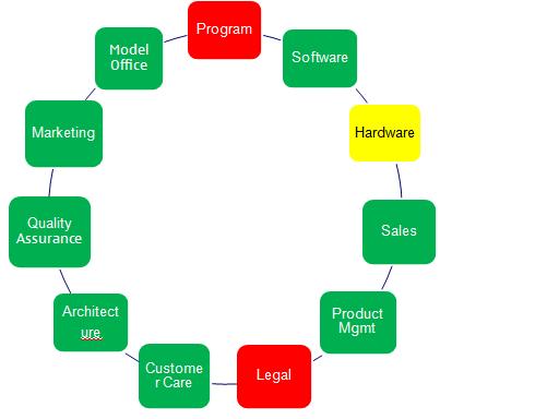
In the diagram below you can see my favourite method of sharing the program status:

There are a few simple reasons why I like this diagram:
- The colour coding makes it easy to see the status of the program overall and all the teams within it.
- All teams are arranged in a circle. This is deliberate and it’s intended to show that all the projects which make up the program need to achieve together for the program to be a success. No one project is more important than any other.
- When the diagram is placed within a PowerPoint slide, it leaves plenty of real estate on the page for you to call out any major issues or risks you want to highlight, enabling you to summarise the entire program on one page.
How to Use The Program Status Template
The beauty of this template is it’s simplicity. There are just a couple of points you need to remember to use it:
- Colour Coding: Use Red, Yellow, or Green to show the status of each team. This is self explanatory so I’m not going to explain here
- If any stream is coloured Red then the Program box should be red to show the overall program is under threat.
That’s it! Simple! I’ve uploaded this template so you can download it and get using it immediately. You can download it from here.
If you have any alternative methods you use then please email me and let me know, as I’m always interested in seeing the methods or techniques used by others.


