The Pareto Principle is also known as the 80-20 rule, which is a general principle referring to the observation that 80% of outcomes come from 20% of causes. You might sometimes hear specific instances of the Pareto Principle, for example:
- 80% of results come from 20% of the work
- 80% of the land is owned by 20% of the people
- 80% of sales are attributed to 20% of customers
- 80% of wealth belongs to 20% of the people
The Pareto Principle is named after Vilfredo Pareto who observed in Italy in the 19th Century, that 80% of the land was owned by 20% of the people. He then developed the principle further by observing 20% of the pea pods in the garden contained 80% of the peas. More information about the history of the Pareto principle can be found on Wikipedia.
Pareto Charts
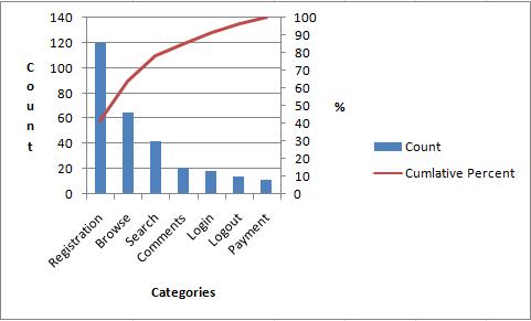
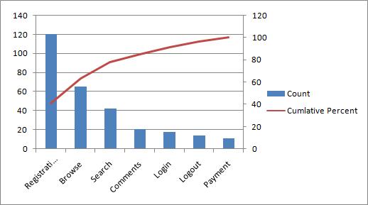
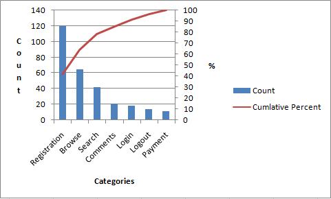
Pareto Charts are used within Six Sigma to aid in the identification of root causes. A Pareto Chart will help you find the most important factors amongst a large set of factors. Essentially, Pareto analysis can be used to help you identify the 20% of the causes resulting in 80% of the problems. A Pareto Chart is a combination of a bar chart and a line graph, with individual values represented by the bars in descending order, and the line representing the cumulative total of the bars in percentage terms. This will be more obvious when you look at the following example:
The Pareto Chart above shows the issues which might occur in an online store. As can be seen, the left-hand vertical axis shows the number of times a particular category of issue has occurred. The right-hand vertical axis shows the percentage of all issues a particular issue represents. On the horizontal axes we have the various categories of issues themselves. This sounds complicated but it’s self explanatory once you look at the chart above.
The Pareto Chart is one of the 7 Basic Tools of Quality. These are all graphical tools which can be very useful in identifying issues related to quality.
There are a couple of pointers you should keep in mind when examining Pareto Charts:
- Look for a break point in the cumulative percent curve. This point occurs where the line begins to flatten out. Issues which occur before this point are the most important. Issues which occur after this point are less important. In the example above I would say that the break point is at “Comments”, meaning that “Registration”, Browse”, and “Search” are the categories most in need of attention.
- If you can’t determine a break point, then this could mean your issues are speadevenly across the categories. In this case you’ll need to use judgement as to which categories are the most important to resolve first.
- Try not to have catch-all categories such as “General”, “Other”, or “Miscellaneous”. Doing this introduces the risk you will not be addressing the most important category of problem first, particularly if your catch-all category has a large number of items within it.
Creating an Excel Pareto Chart
Before we get into the instructions to create your Excel Pareto Chart there are a few things you need to do in advance:
- Decide how you want to categorize your issues. Note that it is considered good practice to have less than 10 categories.
- Keep a count of the number of issues in each category. Do this by examining each issue and adding it to the most appropriate category. You might find yourself changing category names at this stage once you get into the detail of examining issues.
Now that we have collected the raw data, it’s time to go through the instructions to create our Excel Pareto Chart:
STEP 1: Collect Raw Data in Table Format
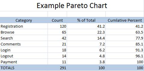
The first step is to collect your data into a table similar to the one shown below.
You can create this table yourself, or simply download and modify the Excel Pareto Chart Template I’ve provided by clicking the link.
STEP 2: Create Basic Table
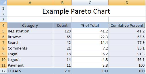
To begin creating your Pareto Chart in Excel, select the Category column, the Count column, and the Cumulative Percent column as shown in the diagram below.
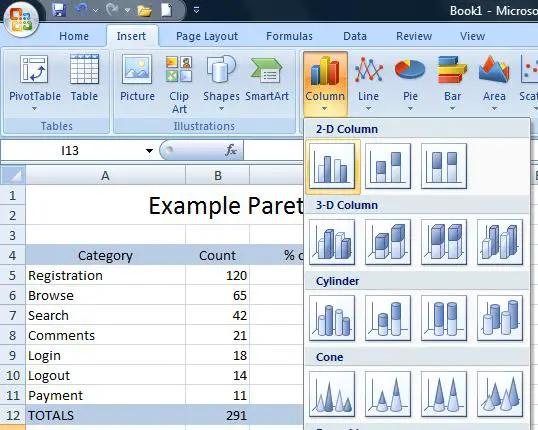
Hold down the Ctrl key to help you in selecting the columns. Notice that you do not select any data elements from the TOTALS row. Now that you have the right columns selected it’s time to create the table by selecting the Insert tab in Excel, the Column button, and then choosing Cluster Column. This is shown below:
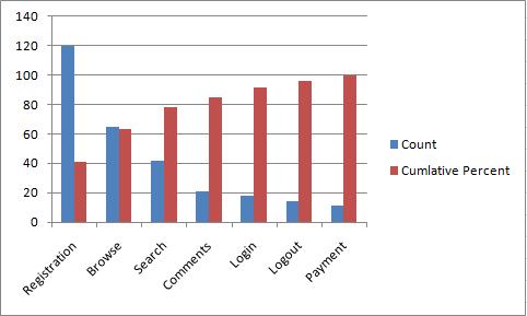
Your Pareto Chart will now look like this:
STEP 3: Create A Basic Pareto Chart
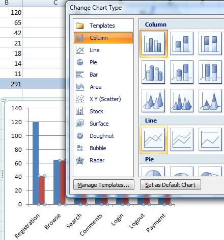
Now that we have our basic diagram, it’s time to make it look more like a Pareto chart. To do this right click on any one of the Culminative Percent bars in the diagram. Select Change Series Chart Type and then select Line as shown below
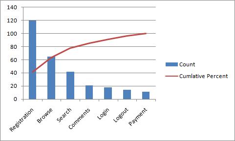
Once you have done this you’re diagram will look as follows:
STEP 4: Add a Second Axes
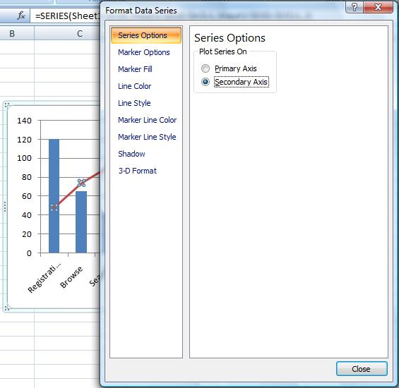
You chart should now be beginning to look like a Pareto Chart, but it will still have just one axes. Now it’s time to fix this. Do this by right-clicking on the Cumulative Total line and choosing Format Data Series. Now select the Secondary Axes as shown below:
Once you close the pop-up window, you should now see the secondary axis as shown below:
STEP 4: Make it Pretty
Your Excel Pareto Chart is just about done. In fact, you can stop after step 3 if you’re just using the Pareto Chart for yourself. However, if you’ve intending to show the chart to anyone else then by following this step you can make it easy for others to understand too.
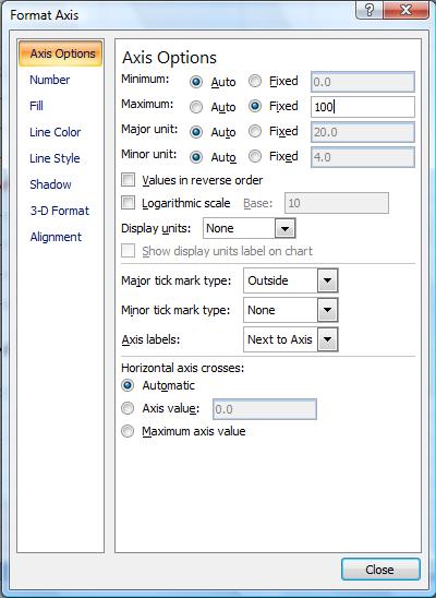
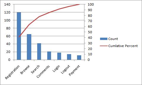
The first thing to do is to get our percent axis to finish at 100% and not 120%. To do this, right click on the right-hand axes and select Format Axes. Now, under the Axes Options tab select Maximum to set it to be Fixed, and then manually set the value to 100 as shown in the diagram below:
This will result in your Pareto Chart looking as follows:
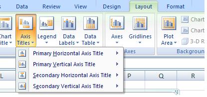
We are almost there. We just need to label our axes and we’re done. To do this select your chart, choose the Layout tab, and select Axes Titles as shown in the picture below:
Congratulations! Your Excel Pareto Chart is complete, and should look as follows:
Pareto Chart Conclusion
The Pareto Principle is also known as the 80 20 Rule, and it refers to the fact that 80% of outcomes result from 20% of causes. A Pareto Chart is a graphical tool allowing you to understand which categories result in the most issues, enabling you to target the most troublesome areas first. This can be done at an organization level, a project level, or a product level, amongst others. Creating an Excel Pareto Chart requires a little bit of Excel wizardry which is why I’ve provided the step-by-step instructions above. However, as a short cut you can simply download the Excel Pareto Chart Template.
