Whether you are managing a large program or a small project you will need to constantly highlight the key risks to your project or program steering group. One of the best ways I know to visually display risks in a succinct manner is to use a Risk Map (also known as a Risk Heat Map).
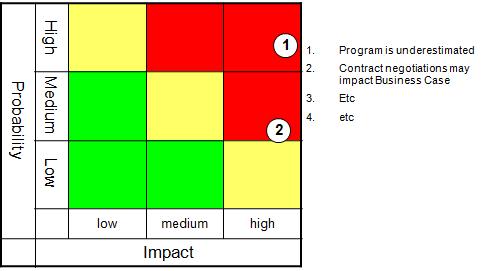
A Risk Map is a very simply diagram which very quickly highlights the key risks to your program or project. An example Risk Map is shown below.
On the vertical axis you have the probably of a given risk occurring, that is, the likelihood that the risk will materialise and become an Issue. On the horizontal axis we have the impact that the risk will have on the project or program should it materialise.
One of the benefits of this method of displaying risks is that it’s easy to see how risky the program or project is. If all the risks are clustered in the top right of the diagram then clearly your managing a very risky program or project.
When analysing risks as part of the Risk Management Process I score risks from 1-5 for both probability and impact, with 1 representing a low probability or impact, and 5 representing a high probability or severe risk to the project or program.
I have uploaded this diagram as part of a ppt so you can use it in your own presentations. On the second page of this template I’ve included a slide allowing you to record the mitigations for those risks you have highlighted. Download the Program Risk PPT template.
