A Value Curve is a diagram which can be used to show instantly where value is created within an organization’s products and services. The Value Curve shows graphically the way the company or the industry configures its consumer offering. It is thus a powerful tool to create new market spaces (blue ocean strategy).
The Value Curve has two purposes. Firstly, it shows the current competitive landscape in the marketplace as it exists today. This information allows us to see where competitors are heavily investing, and also how different products are being positioned to customers. Secondly, the Value Curve allows us to use this information to create new offerings which do not compete with existing competitors, as they create new markets and new demand.
How to Draw a Value Curve
When drawing a Value Curve the vertical axis represents the products available in the marketplace, or the offerings available to the consumer. The horizontal axis represents the factors the industry competes on. You can also consider the horizontal axis to be the range of factors the industry invests in. A higher score represents the customer being offered more, hence we can say that the company invests more in this area.
We can now draw the value curve by plotting the relative values of the different offerings for each of the factors on the horizontal axis.
Value Curve Example
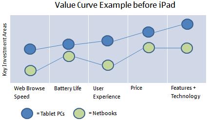
Now that you understand the mechanics of creating a Value Curve let’s actually look at an example. We’re going to look the Apple and the Value Curve they created when considering introducing the iPad to the marketplace. First, let’s consider what the competitive landscape might of looked like at the point of time when Apple was initially analysing the market.
As you can see the market consists of two main types of competitors, netbooks and tablet PCs. You can see that tablet PCs perform better across all the user facing features, but this additional functionality results in a higher price tag. Now let’s see what the Value Curve diagram looks like after the introduction of the iPad.
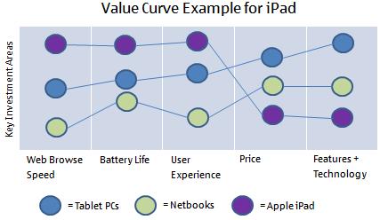
As you can see Apple invested in creating a great user experience, with fast Internet access and a long battery life. The real key to their success, however, was in keeping the price point low by limiting the technology features in the device (not competing in this area). This enabled them to create a new marketplace, and is thus an example of blue sky strategy. In following this strategy for the iPad, Apple did not try to satisfy everyone. Many technology companies try to do this yet to do so is like trying to build a super car that can go off road and carry twelve people, it simply isn’t possible, or if you do try to pull it off you end up failing across all areas (just try to imagine what a super car that can hold 12 people might look like).
Summary
A Value Curve shows graphically where differing products compete within a particular marketplace. It can then be used to significantly differentiate your product from your competitors so that they are irrelevant and you are effectively competing in a new market for different or new customers. All projects and programs within commercial organizations should not be started without the strategy behind the project or program, and the associated Value Curve being understood by everyone on the team. Because projects and programs can be so nebulous to begin with, we don’t just want to do things right, we also need to examine the Value Curve to ensure we are doing the right things.
